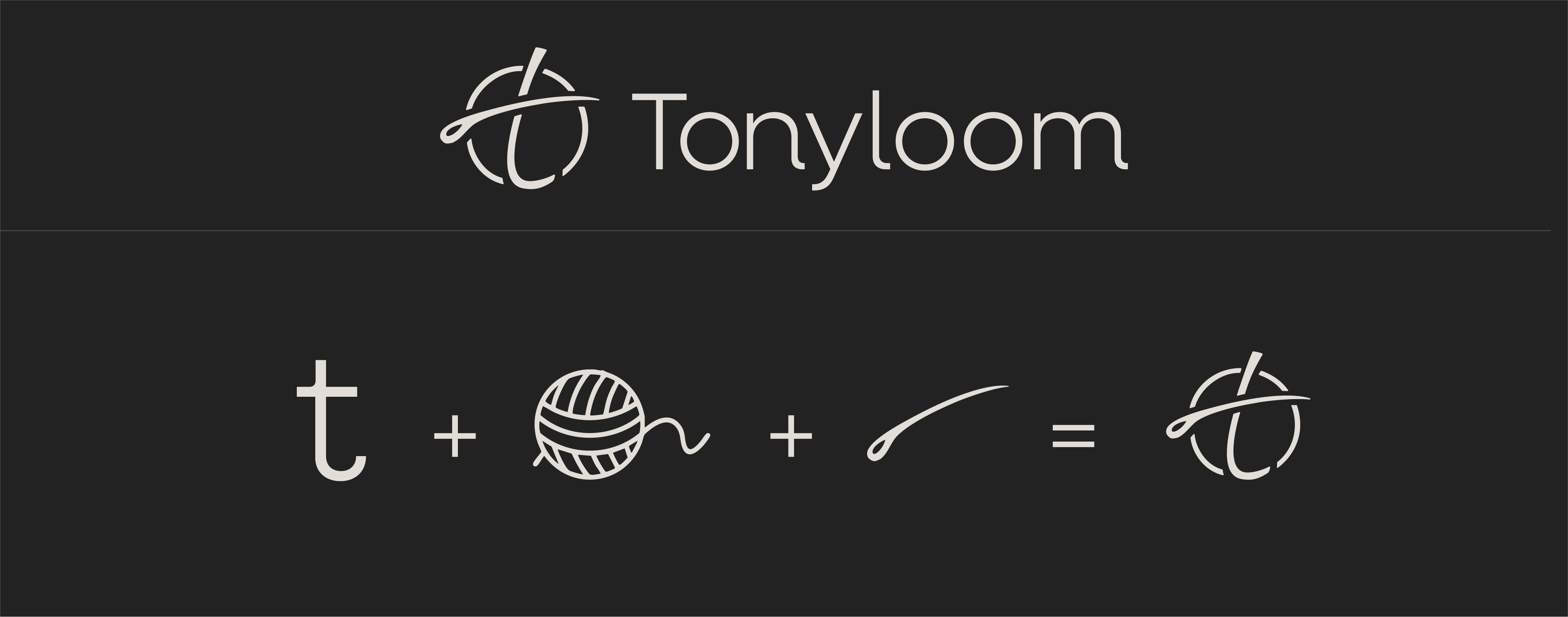
A timeless visual system featuring a custom sans-serif wordmark and complementary logo symbol, refined color palette inspired by linen textures, and flexible patterns/typography that scale across digital, print, and packaging. This elevated Tonyloom's premium positioning, forged deep audience connection through subtle heritage-modern cues, and ensured cohesive brand experiences—delivering unique market distinction and securing swift client sign-off for full rollout.
A Universal Symbol of Craft and Care
The logo emerged from rough sketches in brainstorming sessions, designed to convey far more than a brand name—a deeper sense of shared experience. It fuses three key elements: the "t" for Tonyloom, a circle evoking the hank of yarn central to looms and clothing, and a needle symbolizing craft and care in garment-making. Together, they represent connection, transformation, and the patient weaving of fabrics into community.

Refined Typography, Enduring Palette.
Neulis Neue font pairs elegantly with premium menswear branding, conveying sophistication for mature men who value comfort and timeless style. Its clean, geometric letterforms with subtle softness in curves evoke quiet confidence and modern refinement—use regular and medium weights to ensure high legibility across posters, labels, and packaging.
The core palette centers on deep charcoal navy (#062a4c) as the primary for versatile depth, paired with warm tan (#ccc6b6) for breathable contrast, olive and malaga for natural linen textures, and old ember (#9B4C48) for subtle warmth. "Timeless Comfort," blending standout presence with enduring wearability.


